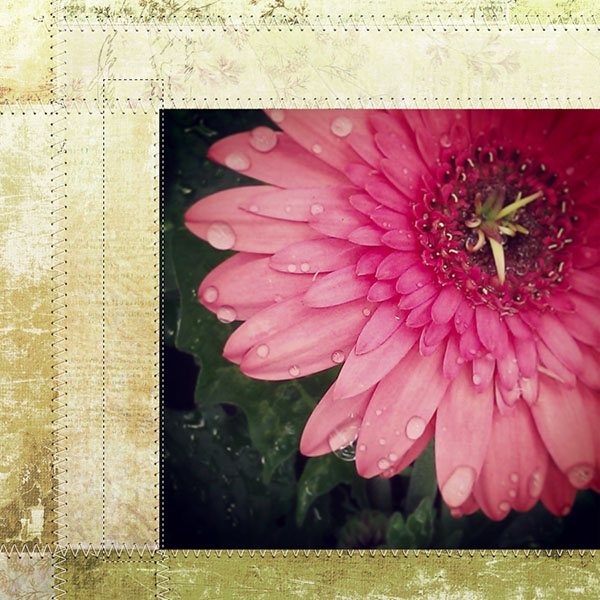
Archive for the ‘Tutorials’ Category

Golden Light Blend Love {how-to}

Sunday, September 23rd, 2012

click-mask-blend supplies here

Using more of my golden light images from our garden taken this summer, I created this quick blended collage using vintage paper Click.Masks 30.

cottagearts-clickmask30-prev v2012_07_10a164copy d2009_06_19a52-sunflare10 d2009_06_13a48camera-raw

FYI…camera specs: canon 7d, tamron 28-75mm/2.8 lens, iso 320, f/3.5, shutter speed: 1/100 second, shot at 8:50 pm on june 13, 2012 in central minnesota (sunset that day was 9:01 pm)

Below is a shot of the Layers Panel (in Photoshop Elements or Photoshop) and how all of the layers are blended together to make this layout.

blend_layers3

Also demonstrated on this piece is another use for our Photo Art Blends 3. As shown above, we blended #04 (30 – 12x12s are included in this set) into the mid-striped Everyday 15 Paper using Hard Light blend mode at 55% adding color, texture, and a photo tranfer-like edge. We also decreased the Saturation a touch on the Photo Art Blend (shortcut: Ctrl+U or Cmd+U on a Mac).

cottagearts-photoartblends3-prev

To learn more details about how to use our creative Click.Masks see how-tos on our blog here. Our Photo Art Blends each come with a PDF step-by-step tutorial with sample recipes.

Happy blending! Michelle and team

Golden Light Love {photo editing how-to & tips}

Friday, September 21st, 2012

2012-07-13-20-48-06-copy michelle shefveland. shot with HTC MyTouch4G cell phone. editing how-to below

As autumn approaches, warm golden light images are on my mind. Lots of idea sharing below, plus a fun tip on how to easily give your light-filled photos a boost in Photoshop/ Photoshop Elements.

We are fortunate to have a summer retreat with a big sunset view over a lake. Each evening I am in awe of the unique gift presented to us. And neighbors often witness me running out to capture the skies, with whatever camera I can grab first…be it the cell phone, point and shoot (Canon S95), or Canon 7D…any one of them is fabulous at capturing skies and sunsets. So I’ve shot lots…and lots of sunsets.

Here are a few tips I’ve learned along the way (all images shown were shot at our lake place over the past four years with various cameras)…

Set your camera to cloudy white balance for vibrant, warmer hues. Or increase the saturation on your cell phone camera settings.

Add people for interest. When looking at the whole scene, your camera will naturally silhouette figures in the foreground, as well as trees and grasses. This is because the sky is SO much brighter and the camera thinks there is a lot of light. Our family likes to have fun being silly. This shot below captures that characteristic. Tip: when shooting movement in such low light settings, bump up your camera’s ISO to increase the shutter speed.

jumping_mshefveland shot with canon 7d

If you are focusing/light metering on your subject and you want them silhouetted, you will need to adjust your exposure compensation very low and depending on the light in the background, it could be up to -2 EV. This is really trial and error because the light levels change quickly during a sunset.

Try different angles, lie on the ground, get high on a hill, move to the end of a dock, shoot in front of trees or grass, etc.

kayaking_mshefveland shot with canon 7d

Experiment with blur and moving the camera. See more ideas and tips on abstract blurs on our blog here. If you have an image stabilizing lens turn that function off, as well as any image stabilizing setting on your camera (even cell phones have this feature).

blur_mshefveland shot with canon 40d in june, 2009. iso 125, shutter speed .4 seconds, set on tv mode

d2009_06_20a47-copy_1 shot with canon 40d in june, 2009. iso 200, shutter speed .6 seconds, set on tv mode

Play around with varied levels of sunset. Often the most vibrant hues are about 15-30 minutes AFTER sunset, as shown above. And, beautiful sunflare is easier to capture with the sun higher in the sky as below.

d2009_06_13a54-copy2-copy shot with canon 40d in june, 2009

Get out on the water itself…in a kayak, canoe, boat, whatever. You can reach out and touch the reflections, as in this black and white water lily image shot right at dusk.

sunset_mshefveland2 shot with canon 40d in june, 2009

Our little editing how-to today will use two simple shots from a cell phone camera, demonstrating how anyone can achieve this type of image. No need to have a big DSLR. Light, composition, and subject matter are key. Editing done in Adobe Photoshop Elements 10, however, most versions of PSE, PS, and Paint Shop Pro would all follow similar steps.

My current cell phone is a HTC MyTouch4G Android system. Love it. With an 8MP camera, it also has touch screen focus and light metering…amazing. I find I now try to automatically do the same on the back of my Canon 7D! Sure, it is nothing compared to a DSLR, however, it is always with me and when using light to my advantage, the results can be quite spectacular.

We use DropBox to automatically transfer cell phone images to my computer system where we have easy access to use them in our digital artwork.

sunsetboost1-beforeafter

This image was shot at Munsinger Gardens, St. Cloud, Minnesota (overlooking the Mississippi River) on September 14, 2012 at 6:48 pm. Sunset was 7:05 pm. I like the shadow play and light hitting the cobblestone path. But it’s quite drab and cold, as shadows close to sunset are very cool. Let’s boost it a bit.

Open Adobe Photoshop Elements

Open  Photo (File>Open>Browse system for Dropbox folder)

Now for the super easy effect.

Use shortcut D to set the color chips to their default of Black and White.

Make the foreground color chip a bright orange. Click on the color chip and enter color number F55714. Click OK to set color.

sunsetboost-color

Add a Gradient Map adjustment layer (Layer>New Adjustment Layer>Gradient Map) to the Layers Panel.

sunsetboost-gradientmap1

It will look pretty weird at this point…no worries!

sunsetboost-gradientmap2

Now, simply set this Gradient Map to Soft Light blend mode.

sunsetboost-gradientmap3

Ta da! That’s it.

sunsetboost1-beforeafter

Here’s the before and after. A nice subtle, realistic transformation.

Now let’s see a bit more of a dramatic change.

sunsetboost2-beforeafter

This image was taken in central Minnesota on July 13, 2012 at 8:48 pm. Sunset on that day was 8:58 pm. It had just started drizzling with the sun peaking out of the clouds, making for dramatic colors and light. All I had on me was my cell phone camera and it didn’t let me down.

I followed the same editing steps as above, however, set the blend mode on the orange-white gradient map to Color Burn at about 40% opacity. Play around with the opacity as Color Burn is intense.

sunsetboost2-colorburn40_0

Note: One thing to be aware of is cell phone camera photos are often noisy in the shadowy parts of the image (as of 2012). I reduced the noise (Filter>Noise>Reduce Noise>play around with settings) and added a duplicate layer of the image. To this duplicate I applied a small Gaussian Blur (Filter>Blur>Gaussian Blur>1-2 pixels). I set this blurred layer on Soft Light Blend mode.

So that’s all there is to it! Play around with shooting and editing sunset shots and see how creative you can be!

As added inspiration, see our golden light loves Pinboard here.

pinterest_golden

Golden Love element tip: Experiment with Color Burn or Linear Burn blend modes with our elements to give them a boost when paired with autumn hues (as done on the layout below).

sunsetperfectday-everydayautumn-fresco2_1 everyday autumn elements, fresco 2 papers, click.masks 32, this is life 5 scrap.words

With instagram and our Photo Booth Strip Templates, I tried to instill in the collage below the peace of being able to experience such beauty.

summerlake2012-photostrips-offbeatenpath13-frameblends michelle shefveland. frame blends 2, off the beaten path 13 papers, photo booth scrap.templates, letting go pak (hinges), words to live by

Here’s some modern art I just made using some sunset images of golden autumn leaves with our new ShapeBlends geometric templates. So fun. They come with a PDF step-by-step tutorial, so you can easily get similar dramatic results!

goldenlight_perfect-day_shapeblends1_fresco2 michelle shefveland. shapeBlends 1, everyday autumn elements, fresco 2 papers

Happy golden light shooting! Michelle and team

Using Frame.Blends/Instant Date Stamp {how-to}

Friday, August 24th, 2012

bayfield2012sail-chevron-frameblends1.jpg michelle shefveland. supplies

A quick and easy how-to…using our new Frame.Blends and one of my favorite date fonts: Misproject. This font gives a distressed vintage date stamp look. Let’s just add two other steps to give even more realism (like you really stamped it on your page).

We’ll also show how fun, easy, and versatile the Frame.Blends are! They come with and without a subtle photo blend overlay and are sized perfectly for your instagram shots (or any other square photo). See below for how you can combine the two versions for more variations.

cottagearts-clickartistry-frameblends1-prev.jpg

Here’s how:

  1. Open Adobe Photoshop Elements (or Photoshop/Corel Paint Shop Pro)
  2. Open 12×12 background paper of choice (Chevron Blends)
  3. Open Frame.Blends (opened both 10 and 10Blend)
  4. Drag both onto paper (they are identical except for 10Blend having a ready-to-use texture overlay included)
  5. Open 4 photos (mine are instagram shots) img_20120617_183410.jpg
  6. Drag onto layout
  7. Resize and position photos, as desired
  8. Adjust layer position of both Frame.Blends to be on top of photos in the Layer Palette (non-blend frame should be on top) frame_blend1.jpg
  9. For some layouts or images you may desire less texture on the Frame.Blends (which is the reason we offer them plain and with a photo blend overlay; you can use them in duo). Play with the opacity of the 10Blend FrameBlend to preferred amount of texture and color. In this sample we set the opacity to 35%, since instagram shots already have texture applied.
  10. Using Type Tool, select Misproject font, color, and size desired
  11. Type date as shown with spaces to look like a vintage postage stamp datestamp2.jpg
  12. Now…simply rotate font a touch with the Move Tool so it isn’t perfectly straight
  13. And, decrease the opacity to let the layer beneath it show through for more realism (will vary based on color of text and layer beneath – sample used 62%) datestamp1.jpg
  14. To complete, we added a frame and word art quote from Words to Live By Scrap.Words, changing the color of the frame to a warm gray (shortcut: Ctrl+U; mac: Cmd+U) to match the photo corners on the frame.blend. We used the frame to hold a bit of journaling on the top left edge. bayfield2012sail-chevron-frameblends1.jpg
  15. That’s it!

In this next two collages, Marie creatively used Frame.Blends to accent her word art.

watercolor-paper-opt.jpg marie di raimondo

watercolor-o-pt_0.jpg marie di raimondo

For the soft piece below, I combined a painted Click.Mask with a Frame.Blend trio for extra softness. Works well with baby shots.

hannah-blossomblends-frameblends1.jpg michelle shefveland. supplies

Note: our What’s New newsletter went out Friday afternoon, with a great sale on all Element Paks (including the Frame.Blends), coupon code, and lots of new products!

And, here are more ideas using Frame.Blends from our team. All layout details in our Frame.Blend gallery here.

philip_kayak.jpg michelle shefveland

201207_sunset.jpg tonya regular

bayfield2012-naturesketch10-worldtravels-frameblends.jpg rachel shefveland

bruzeklove-4-2012-simplyyou-scrapblends1.jpg michelle shefveland

borntocreate2012-piecesme11-12-frameblends1.jpg michelle shefveland

blossom2012-roadless-simplyyou.jpg michelle shefveland

alyssa-grad2012-chevronblends-lovegrows.jpg rachel shefveland

Happy creating! Michelle and team

Guest Photo Blend Tutorial at Somerset Place

Tuesday, July 17th, 2012

02_somerset-photoblend-mshefveland-web.jpg michelle shefveland. photo art blends 5, botanical banners, butterfly danglies, say it again 2 scrap.words

I recently had the wonderful opportunity of working with my friends at Stampington on a guest tutorial for their blog. Since they have many paper and traditional artists we wanted to share a fun digital tutorial that wasn’t intimidating for those new to digital art. You can find it on their beautiful blog here (with a special coupon code to our shop, too).

Look for my upcoming Digital Workshop article in their Fall 2012 Somerset Memories issue. I can’t believe it’s already seven years as a columnist for them!

Enjoy! Michelle

Instant Vintage {how-to & ideas}

Saturday, July 14th, 2012

ca_down-on-the-farm2_0.jpg karen wilhelm. faded memories border bits, down on the farm papers & elements, click.masks 30

When I first saw this layout of Karen’s grandfather’s ranch I was immediately drawn to its worn, vintage feel. Granted, the image was shot in the 60′s so was already ‘vintage.’ But by simply clipping to one of our torn papers Click.Masks, texture and more age was added, blending it into the painted scenic background paper.

Here’s how easily it’s done using Adobe Photoshop Elements (Photoshop follows similar steps):

  1. Open Adobe Photoshop Elements
  2. Open background paper (Karen used the painted field paper from Down on the Farm Papers)
  3. Open desired Click.Mask (Karen used 05b from Click.Masks 30) and drag onto paper. Note: a feature in our Click.Masks is most sets come with two varied distressed versions of each click.mask so you can sample both to see which intensity you like best. Sometimes you want a more soft painterly look and sometimes a stronger image. So we offer you both! cottagearts-clickmask30-pre.jpg
  4. Karen flipped the Click.Mask horizontal (select Image>Rotate>Flip Layer Horizontal) vintage_1.jpg
  5. Open photo and drag onto layout, resizing and repositioning as needed with the Move Tool vintage_2_move.jpg
  6. Clip the photo to the Click.Mask (Layer>Group with Previous or shortcut Ctrl+G; Mac: Cmd+G) vintage_3_clip.jpg
  7. Voila…because of the painted background and aged paper click.mask, the result is an instant vintage painting effect!

I created a similar effect in my horse layout below using current photos taken with a Canon 7D. Any photos are given instant age and texture.

horse2012_downfarm_borderbits.jpg michelle shefveland. everyday 2 papersfaded memories border bits, down on the farm papers & elements, click.masks 30

Patti showcased an amazing heritage image using a similar technique, while adding another photo to complement her page.

growin_-up-country.jpg patti senter. down on the farm papers 2 & elements, click.masks 30

FYI: see many more Click.Mask how-tos on our blog here.

Our team shared their love of horses and country with more stunning layouts using Down on the Farm art. You can see details in our gallery here. With over 20 in the gallery be sure to see all three pages.

Happy creating! Michelle

Give your Word Art Subtle Pop {how-to}

Tuesday, May 29th, 2012

garden2012-springgreen-clickmask27.jpg michelle shefveland. spring green pak, click.masks 27

In this layout of my aunt Jackie’s pretty little potted garden, the word art was positioned over the photo and needed some pop so it could be more readable without being distracting. An easy technique to achieve this was adding a subtle Outer Glow Layer Style to the word art.

Here’s how it looked before the Outer Glow was applied…a bit hard to read.

garden2012-springgreen-before.jpg

To add an Outer Glow Layer Style in Adobe Photoshop or Photoshop Elements:

  1. Select Word Art layer in Layer Palette 5garden2012-glow.jpg
  2. In Photoshop Elements 10, select Layer>Layer Style>Style Settings 1garden2012-style.jpg
  3. In Style Settings Dialog click on Glow box 2garden2012-glow.jpg
  4. In expanded dialog check Outer and adjust Glow settings 3garden2012-glow.jpg
  5. In our sample we set it to Size 15 at 75% Opacity
  6. To adjust the color of the Outer Glow effect (we left it in the default yellow), click on the color box to the right of the Outer Glow adjustment settings. Choose color and Select OK.

Note: in Photoshop select Layer>Layer Style>Outer Glow>Adjust Settings>OK

That’s all there is to this quick how-to! Experiment with varying colors, opacities, and size for different effects.

See our Word Art Sticker how-to for a more pronounced, whimsical effect.

sticker-6.jpg

Keep learning!

Michelle

Using New Click.Stamps {how-to}

Sunday, May 20th, 2012

linens_and_lace1_resize.jpg beth ervin

We just released eight new products (three shown below), one of which is the first in our Click.Stamp series. These pretties serve double duty as both artful accents (as Beth shows above) and Click.Masks for papers and photos (how-to below).

cottagearts-clickstamps1-artdeco-prev.jpg cottagearts-clickmasks26-prev.jpg cottagearts-whispersoftime-preview.jpg

Rachel demonstrates below how she used one of them in this collage as a Click.Mask for the smaller image (using Photoshop Elements – Photoshop and Paint Shop Pro follow similar steps).

arizona-cherishmoment-whisperstime-piecesme12.jpg rachel shefveland. pieces of me 12 papers, click.stamps 1, whispers of time elements, click.masks 26

To build the layout from the bottom up, she added a base of two different linen papers from Pieces of Me 12 Papers, resizing the top cream linen slightly smaller than the bottom paper using the Move Tool. To the top linen paper she blended the large photo using Overlay blend mode, while also clipping the image to the paper.

FYI…she clipped the photo to the linen paper using Layer>Group with Previous (or shortcut Ctrl-G; Cmd-G on a Mac). See our basic Click.Mask tutorial for how to clip papers and images to masks or shapes.

Lots of blending on this layout. After adding a lace click.mask from Click.Masks 26, she clipped one of my apple blossom images to it at 60% opacity, adding color and depth.

blend_4.jpg

After opening, dragging, and positioning the art deco Click.Stamp, she opened the smaller photo of me, dragged it onto the layout, sized it, and positioned it over the Click.Stamp.

blend_2.jpg blend_3.jpg

She then clipped the photo to the Click.Stamp as directed above.

The word art is rotated 90 degrees left and set to Color Burn at 70% opacity, adding a rich tone and texture.

blend_1.jpg

Here are some more collages using the Click.Stamps just as they are…with their distressing and added brushwork they blend beautifully into papers by just dragging and dropping.

scrapbook_page_491.jpg rachel shefveland

nouveausample-piecesme12.jpg michelle shefveland

FYI…our newsletter went out Sunday am. Check your e-mail for this weekend’s sale, coupon code, 8 new product releases, and team inspiration!

Free sign-up here.

Happy creating! Michelle and team

Love Grows {tips & ideas}

Sunday, April 22nd, 2012

bruzeklove-32012_naturesketch8_lovegrows.jpg michelle shefveland. photo by melinda ver meer

We just released our largest Nature’s Sketchbook Collection: Love Grows.

Including Scrap.Words, Click.Masks, layered papers, Scrap.Frame clusters, vintage journals, and oodles of botanical collage papers, this series seems to have something for everyone. With its vintage damask patterns, soft plum and cyan hues, worn chicken wire, torn and tattered papers, we celebrate our love of nature, gardening, and vintage. Not all shown above.

The team spent some time playing with the collection and below are just a few of our creations. See our Love Grows gallery for all of them, plus layout details and creation tips from the team.

Note: in our gallery we always try to let you know in the description if we used a more advanced technique, such as blending of two papers together, etc.

scrapbook_page_477.jpg rachel shefveland

For example, one of the tips Rachel gives in the gallery of her Easter egg page (above) is how she achieved the aged photo look on the lower photo.

eggs_mshefveland.jpg michelle shefveland. Canon 7D and Canon 35mm/1.4 lens

She dragged the image onto the mat cluster, sized it to preferred size with the Move tool, and set the blend mode to multiply at 85% opacity, picking up the tone and texture of the inner mat beneath it. Using a soft edged round eraser brush, she removed the photo where it overlapped the top journaling mat. Voila!

eggs3_mshefveland.jpg

FYI…using brown eggs and vinegar in the dye made them so warm and vibrant!

Below, creating a lifted drop shadow on its own layer, the photo appears to be hanging from the chicken wire. See our realistic drop shadow tutorial for details on how to create your own lifted drop shadows.

bleeding-heart.jpg rachel shefveland

The branch frame cluster and all other frame/mat clusters in this collection come with their own lifted drop shadows, saving you time!

For another creative idea, Tonya added two hand-cut images side by side inside a frame dangly (from Get it Framed Danglies 4) for a unique twist.

201203_naturally_you.jpg tonya regular

Beth is a master at layering frames and other elements, further bringing focus to the photo. Layering papers in different shapes and cuts is also a fun technique to use.

love_grows2_resize.jpg beth ervin

Feel free to contact us, as many have always done, if you have any questions about any technique! Simply send us the link to the layout in question and ask what you’d like to know about. :)

Our What’s New newsletter with two-day sale details and subscriber coupon went out Sunday morning. Enjoy!

Happy creating! Michelle and team

Click.Mask Blending no.3 {how-to}

Sunday, February 19th, 2012

toby2012-lovefresco-clickmask22-lettinggo.jpg michelle shefveland. Love Fresco Papers, Letting Go Pak, Simply Love 2 Scrap.Words

Stopping in for a creative edition of our Click.Mask blending how-to’s as our newest set, Click.Masks 24 – Love Fresco, has even more possibilities and we wanted to explore those with you.

cottagearts-clickmasks24-prev.jpg Love Fresco Papers, Click.Masks 24

Note: our newsletter went out on Sunday afternoon. Check your e-mail for new ideas, products, quick tip, two-day sale, and additional subscriber coupon code.

Not signed up yet? Free sign-up here.

Here’s how in Adobe Photoshop Elements. Adobe Photoshop and Corel Paint Shop Pro would follow similar steps.

  1. To begin we opened up a favorite paper, 07 Love Fresco.
  2. The three elements we’ll be blending on this layout are the bead spray from Letting Go, Heart Bokeh Click.Mask, and little photo of our puppy. Open and position onto paper. click_mask_4.jpg
  3. The Click.Masks in this set are black. To assist in the blending process, let’s change the color to white by pressing Ctrl-U (Mac: Cmd-U) and setting the Lightness to 100. Click OK. click_mask_5.jpg
  4. Open a paper to clip to the mask. We chose a creamy painted paper from Art Journal Fresco Papers. Position over the mask.
  5. Clip to the mask using the shortcut Ctrl-G on the paper layer (Mac: Cmd-G). Set the layer blend mode of the white mask to Overlay. Note: for a more detailed tutorial on using Click.Masks see our first in the series here. click_mask_1.jpg click_mask_6.jpg
  6. Repeat for Bead Spray using a duplicate layer of the red paper clipped to the beads. Set the layer blend mode of the paper layer to Color Dodge at 80% opacity. click_mask_8.jpg
  7. Now for blending the puppy into the lower left painted region of the paper. Use a soft eraser brush to erase the background of the photo.
  8. Duplicate the puppy photo layer (Layer>Duplicate Layer).
  9. Set the bottom puppy photo layer to Soft Light. Top layer to Normal at 50% opacity. Your settings will vary depending on the photo. click_mask_2.jpg
  10. Finish layout with main focal photo, layered vintage frame, tag, and date.

click_mask_9.jpg michelle shefveland. Love Fresco 3 Papers, Love Blooms Pak

An opposing technique is to blend a shape into a paper beneath it. For the layout above I blended the word art and decorative border strip into the Love Fresco paper, both using Color Burn blend mode. So easy and so many options!

201202_simple_smile_0.jpg tonya regular. supplies here.

Tonya used two other Love Fresco masks to clip her image as well as create a synchronous design accent. The focal photo used a simple clip on Normal blend mode. The script heart was blended using Multiply blend mode at 70% opacity.

fresco2_resize1.jpg beth ervin. supplies here.

Beth blended many clipped Click.Masks and Love Fresco papers using Overlay blend mode in her dreamy vintage piece.

See additional Click.Mask blending tutorials here and here on our blog.

Happy blending! Michelle

Layout Mosaics {how-to}

Wednesday, November 16th, 2011

thanksfulmosaic2-2011_majestic_fall.jpg michelle shefveland

Hello! The team had a blast recently creating mosaics out of collections of past digital layouts. A great idea for a first page of an album or last page, or a re-cap of the year page.

The easiest method for completing a mosaic is to use one of our Scrap.Templates featuring square Storyboard Scrap.Frames – sets 13, 14, 26, 27, 29, and 33 are fitting choices. This will offer you individual clipping masks for each image spot beneath the frame (below Beth used one from set 26). Otherwise, you can use one of our Scrap.Frames and size and position layouts below each opening as I did above.

scrap_templates_26-1_resize.jpg beth ervin

cottagearts-scraptemplates26-prev.jpg

Here’s how using one of our layered Scrap.Templates with Adobe Photoshop Elements (Photoshop and Paint Shop Pro would follow similar steps):

  1. Decide on how many and which digital layouts you want to feature in your mosaic. Or, you might want to pick out a template first to decide how many layouts you can use. Both Beth and Melinda used 01 Scrap.Template 26.  Tip: I keep printable jpgs of all finished digital layouts in a folder named Layouts (and layered psds in another folder). I can then sort by date to see most recent. I also name each layout with the subjects name and year. So all Alyssa layouts from this year would have Alyssa and 2011 in the file name. You can then search within your folder for such names, making it easier to narrow down.
  2. Open Scrap.Template 01-scraptemplate26_cottagearts.jpg
  3. Open all desired layouts. Flatten if in layered format (Layer>Flatten Image). Note: do not save over original layered file.
  4. Resize all chosen layouts to approximate size needed beneath frames. Tip: to view ruler in Adobe PS or PSE select View>Rulers (Shift+Ctrl+R or Cmd+R on a Mac). For Melinda and Beth, the frame openings allow for about 2.75 inch squares. I like to drag all of the layouts onto one of them and then resize all at once (Image>Resize). mosaic_1.jpg
  5. Click and drag all layouts onto template. Tip: when using this technique you’ll need to unlock the bottom most layer or it won’t drag with the other layers. To do so, double click on the lock symbol in the Layer Palette on bottom layer, Click OK on New Layer dialog box. Select All Layers (Select>All Layers or Ctrl-Click them in Layer Palette), then click and drag onto template. mosaic_2.jpg
  6. Move each one into position. Rotate if desired, as some template’s frames are rotated a bit. mosaic_3.jpg
  7. Move each layout into correct layer position in layer palette by moving right below its frame. Shortcut: Ctrl+[ or Cmd+[ on a Mac to move a layer downward one layer at a time.
  8. In certain instances you may want to show only a portion of your layout or photo, therefore having some spill outside of frame until you clip to mask. If so, clip to corresponding clipping photo mask by selecting Layer>Group with Previous in PSE or Layer>Create Clipping Mask in PS. mosaic_4.jpg
  9. Now the really fun design part! Decide on the theme and choose a kit that coordinates with the theme. Beth used Autumn Fields as it was used in most of her featured layouts. Melinda wanted to celebrate her son’s sixth birthday with a collection of layouts spanning his life and Spunky Monkey fit his personality to a T! timeline.jpg melinda ver meer cottagearts-spunky-monkey-page-pak.jpg
  10. Open a paper for the background. mosaic_5.jpg
  11. Click and drag into place on top of the background in the Scrap.Template.
  12. Melinda also added a creative twist by filling each of the nine frames with a different paper from Spunky Monkey using the frames as clipping masks (using instructions included with each Scrap.Template set). Using Steps 4-8 above, she resized each paper to about 4×4, dragged them onto the layout, positioned them, mosaic_6.jpg then clipped them to the frames (size of pattern will dictate how much you want to downsize). Fun!
  13. Click on title text to activate Type Tool. Choose font, font color, font size and enter title (or add decorative word art as Melinda did).
  14. Add extra elements if desired, as both Beth and Melinda did.  timeline.jpg
  15. Add personal journaling using Type Tool and any text path offered for journaling on the template.

And, here’s how using one of our Scrap.Frames (and digital kits[s] of choice) with  Adobe Photoshop Elements (Photoshop and Paint Shop Pro would follow similar steps):

Follow same steps above using any digital papers, Scrap.Frames, word art, and elements to design your own mosaic collage. Disregard Step 11 and simply resize and position your layouts manually beneath the Scrap.Frame openings.

2011_preserving_childhood.jpg tonya regular

Tonya mixed it up a bit by varying the size of her layouts as well as using a Scrap.Frame without all square openings. Very cool!

Click on layouts below from Karen, Patti, Beth, and I for more variations. See all of today’s layout details in our mosaic gallery.

Happy creating! Michelle

Related Posts Plugin for WordPress, Blogger...