The premise of good design is
using these simple principles: balance, repetition, emphasis,
and unity. A good layout does three
things: a good layout works, a good layout organizes, and a good
layout attracts.
Space on a layout is as important as the photos and the
story behind them. Space creates an equal distribution of
visual weight and balance and is simply an area on your page
with no images or words. The balance created by space is
what will ensure a strong focus on the element of your
choice, photos or journaling. To achieve unity of all your
elements, they must look like they belong together,
including blank space.
Placing space on a layout can be tricky, since we all have so
many photos and elements we want to use in every nook and
cranny. Remember a layout can become too busy with too many
elements and distract from the focal point. Space provides
rest for the eyes, makes the layout easy to follow, and will
highlight the elements of your choice.
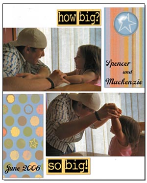
Be conscious of areas of trapped white space. Trapped
white space is any open area on a page that is "boxed
in" without any direct relationship to another visual
element, or the edge of the page. This space has a
tendency to distract from the focal point and makes the
layout hard to follow. I have used white space
repetition on my sample layout to illustrate how white
space with a direct correlation to the edge of the paper
is pleasing.
Space is a breath of
fresh air for any viewer!
Beth Ervin, Co-Editor
CottageArts.net