Who doesn’t love discovering new skills using your digital art stash to make digital scrapbooking even more economical, uniquely you, and such fun?! Today we’ll share four simple customization techniques: selective re-coloring of embellishments/papers, rearranging word art, custom drop shadows, and blending of Click.Masks to complement your photos and design.
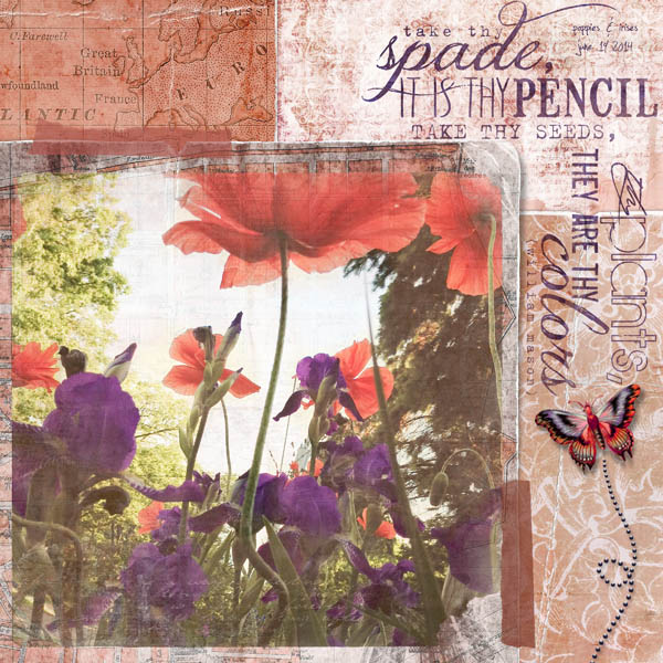
Many digital scrapbookers like to use a coordinating kit of papers and elements and keep colors as they are and add photos that complement those colors. That’s awesome! Others like to mix and match papers, elements, and word art from various kits and then part of their creative process fun is making them work together cohesively with a chosen photo or set of images (and many like to do some of both!). Here’s one example of that mix-n-match process for the layout above…
Mix-n-Match
First off, I had chosen an iPhone photo of poppies and irises as the focal subject of my art. To this I added a World Travels 2 collage paper, torn paper Click.Mask, Love Grows Scrap.Word quote with butterfly, and butterfly trail. Kind of a hodge podge of unmatched stuff. But let’s see how fun it is to bring it all together.

Creative Recoloring
The easiest and most common edit is probably re-coloring of papers. For this multi-patterned map collage paper I simply changed the overall hue -16 in Photoshop Elements (Ctrl-U for PC or Cmd-U for Mac shortcut) from tan to a warm salmon.
Next I changed the hue of the blue word art to plum (+67).

A bit more involved, but really useful, technique is selective recoloring. See the butterfly element? It was originally teal and gold and I wanted it plum and salmon. Hmmm…how do you do this? In two steps. With the first step, you do as above and make an overall color change to one of those colors. In this case, we made the center of the butterfly salmon. This made the outer part of the wings green.

OK. Now, the really fun part. Select Enhance>Adjust Color>Replace Color. Using the eye dropper selection tool in the Replace Color dialog (default selection tool) and your mouse, click on the color in the element you want to change. I clicked on the green in the wings. You have some leeway here on the amount of matching of that color with the Fuzziness slider. In the lower part of the dialog box play with the Hue, Saturation, and Lightness sliders to get your desired end color. For me, I set the Hue to +155 for a soft plum and now I have a beautiful complementary butterfly.

Rearranging Word Art
With word art you might love one of our quotes’ font work, but once you get your layout designed it might not lay out as you really want. With just a few steps in your image editor, you can quickly and easily rearrange most word art. As I worked on this design in particular, the Click.Mask fit beautifully in the lower left square block. The word art in its original square footprint didn’t jive with this. I came up with the idea to cut it in half and rotate the bottom half so it wrapped around the photo at the top right. So easy to do.
Simply select the word art layer in the Layers Panel, select the Rectangular Marquee Tool and draw around the part you want to cut away with the mouse or your tablet’s pen tool.

Select Edit>Cut and then Edit>Paste and your selected word art will be moved to its own layer to move. I then rotated it 90 degrees right (Image>Rotate>Layer 90 Right) and with the Move Tool positioned it where I wanted it. Done! At this point you could also change the color or size of this portion of the word art for even more variation.
Custom Drop Shadows
Finally, as shown in detail in my custom shadow tutorial (using Photoshop Elements), I also opted to add a lifted drop shadow to the butterfly for more realism.

So, there you have it! A completely custom piece all your own. And lots of ideas to keep you scrapping for eons (ok…maybe that’s an exaggeration)! Here’s the final again:
Blending/Recoloring of Click.Masks
Another editing technique we have featured on the blog before is changing the color of our Click.Masks in order to enhance blending into the paper layer beneath. Featured in the layout below, I changed the color of the black painted Click.Mask to white, setting the blend mode to overlay and then clipping the photo to that click.mask. See a detailed how-to on our blog here. I also re-colored the word art to blue to complement my dress.

More Inspiration
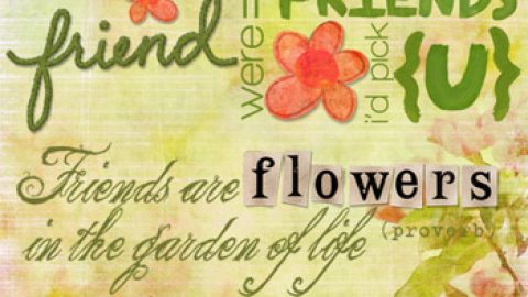
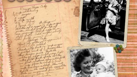
Below, our team had fun recoloring and rearranging elements and papers for these pretty pieces. See layout details, including creative edits, in our gallery here.
Happy creating! Michelle and team