
|
Never Fear Shadows |
Shadows play a vital role in making digitally created scrapbook pages look realistic. They give a ‘lumpy’ appearance to an otherwise flat layout. Shadows, when done right, will bring your pages to life.
Here are some things to keep in mind before you apply any shadow to your layouts:
- What kind of statement is your layout making? Is it subdued and mellow or playful and “loud”? –Make the shadows match the mood.
- Where is your “light source”? Above, below, left, right? Is the light direct or indirect? Even when using dramatic shadows, we need to keep them realistic to the “light source”.
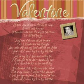
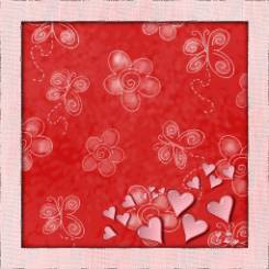
I created a layout for my husband as a Valentine’s Day present using Simply Papers CD, Simply Elegant CD, Jasc Paint Shop Pro 8.1 and Love Font. While I'm happy with the look of this page, there’s something missing. It seems so flat and lifeless.
I’m going to address the striped paper first. Assuming that my light is coming from above, and is indirect, I choose to go for a very soft, subtle shadow. After highlighting my title layer on the palette, I choose Effects>3D Effects>Drop Shadow and use the following settings (7, 6, 85, 19, Shadow on New Layer):
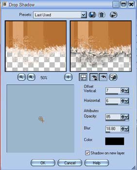
One thing to note with my settings is that I always check Shadow on New Layer. This gives me more control over the shadow once it’s been applied to the image. I can decrease opacity more, if the need is there, and I can change the blend mode as well.
Now I want to address the title. It looks pretty, but doesn’t stand out in any way. It’s just a word at this point. Again, I highlight my title layer in the layer palette, choose Effects>3D Effects>Drop Shadow, and use the following settings (5, 8, 64, 15, Shadow on New Layer):
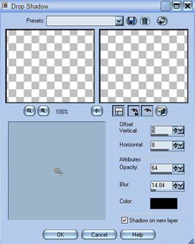
I changed the angle of the shadow just a bit, as well as the opacity and blur. My earlier shadow was too much for the title. This is more subtle and gives the text the slight lift it needs to pop off the page.

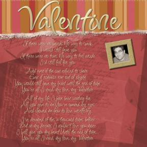
I opted to use the same settings for the main text on this layout. The words are easily read now, whereas they blended into the background before.
Fortunately for me, the picture frame (from Simply Elegant) I used in this layout came with a shadow. J The full layout, with shadows, is now complete and looks fabulous!
Supplies: Old Letters
Burgundy Background Paper (Simply Papers)
Elegant Stripes Brown Background Paper (Simply Papers)
Picture Frame cut and pasted from "In A Garden" layout template (Simply Elegant)
Font: Inspiration by Rob Leushke
There are many other great uses for shadows. Use them to create shaker boxes and tags. I’ve also used them to make a watermark on some of my photographs. Change the color of the shadow to white to give a glow effect. Most of all, have fun with them!
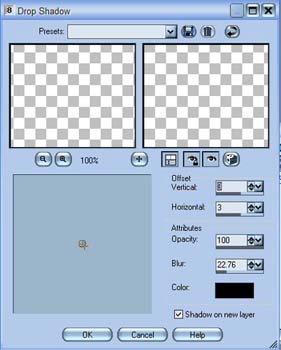
I used the following settings on the border to achieve a shadow box effect (3, 3, 100, 23, Shadow on New Layer):
Supplies:
Groovy Red Sponge Background Paper, Simply Sampler CD
Heart tube: Paint Shop Pro 8
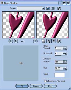
I used the shadow effect, with white as my shadow color, to create a glow effect for the following title (5, 6, 100, 39, Shadow on New Layer, White):
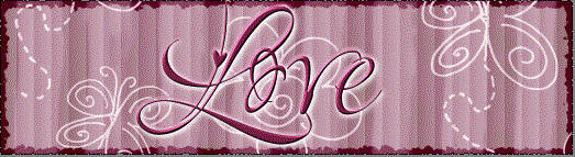
Supplies: Groovy Pink
Stripes Background Paper, Simply Sampler CD
Font: Love by Rob Leushke
In this quick tutorial, I hope I've encouraged you to play with this powerful effect and explore different settings, colors, and directions of shadows.
"Never fear shadows. They simply mean there's a light shining somewhere nearby." ~~ Ruth E Renkel
Leila
Written by Leila Schweiss, Copyright 2004 CottageArts.net, All Rights Reserved.